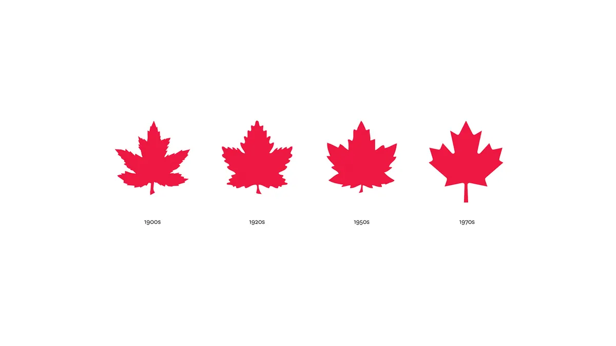

The Canadian Olympic Team gathered a century of maple leaves into one identity.
Team Canada
More than a century after Canadian athletes first wore the maple leaf at the 1908 London Games, the Canadian Olympic Committee wanted one identity for the whole Team that could last for decades. We were part of the small design team that made it, and the COC unveiled the identity on June 6, 2011.
- Client
- Canadian Olympic Committee
- Sector
- Non-profit sport
- Unveiled
- June 6, 2011
- What we delivered
- Brand strategy, brand architecture, marks and lockups, type, colour, an 86-page brand manual, stationery, copy and the identity film
- Credits
- Designer and director: Ben Hulse. Designers: Greg Durrell, Adam Bognar and Andrew Simpson.
- Identity film and motion graphics
- Ben Taft
- Recognition
- Two Brand New Awards in 2011: Comprehensive Identity Programs and Guideline Documents
What they needed
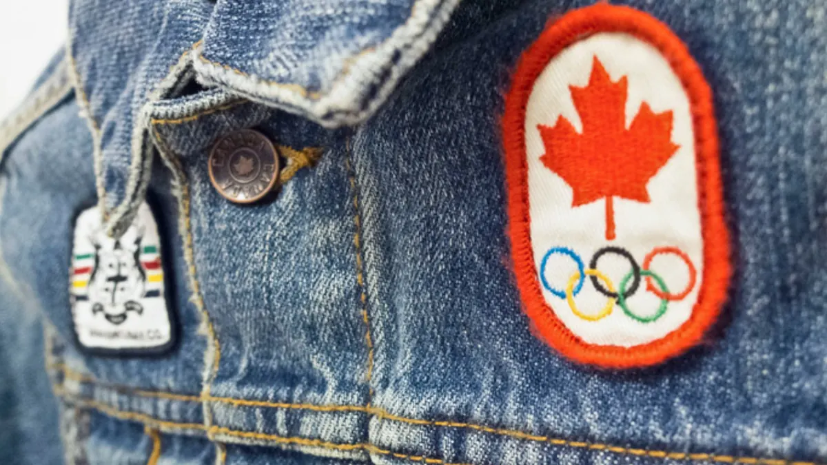
The Canadian Olympic Committee supports Canada’s high-performance athletes and leads the country’s part in the Olympic Movement. Canadian Olympians wore the maple leaf for nearly 60 years before it became the single icon on the national flag. A century of use had splintered the leaf into dozens of marks that no longer agreed with one another, and the public face of the brand had drifted from the athletes to the Committee.
The brief set out to position the Team as a classic sports brand. The Committee’s programs, teams, corporate partners and federations had to line up in one system that would age well.
What we did
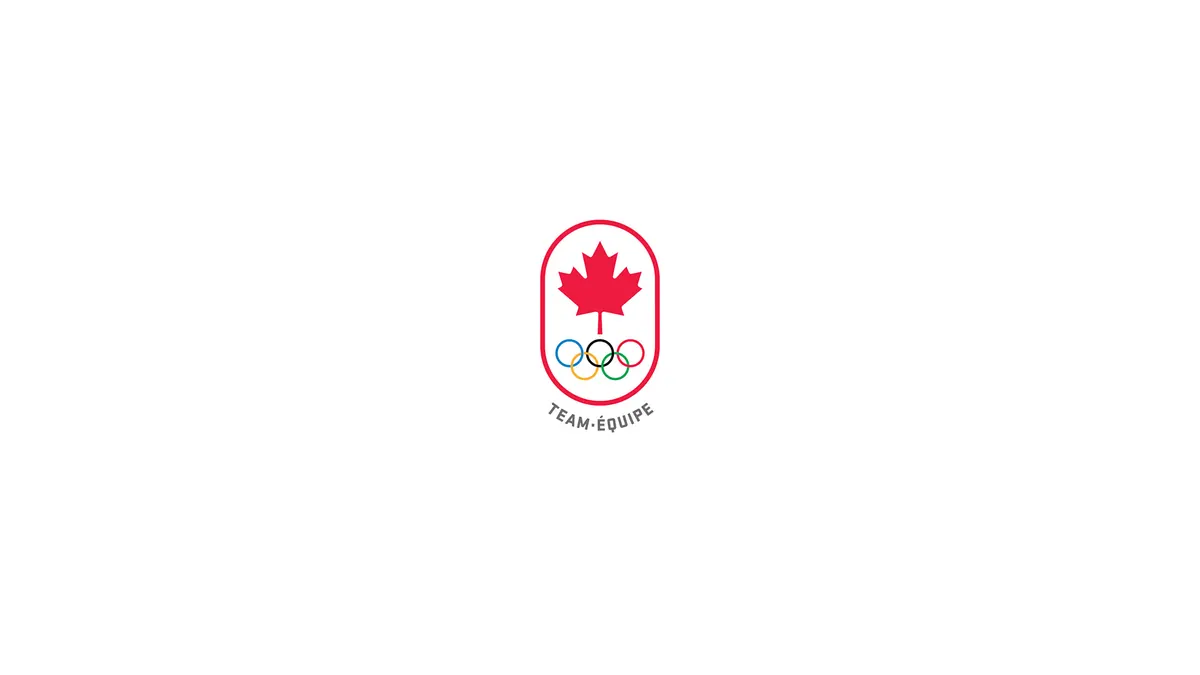
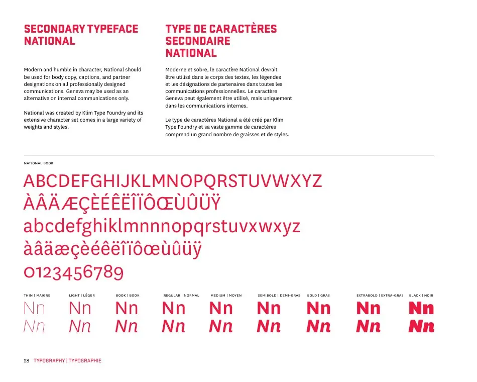
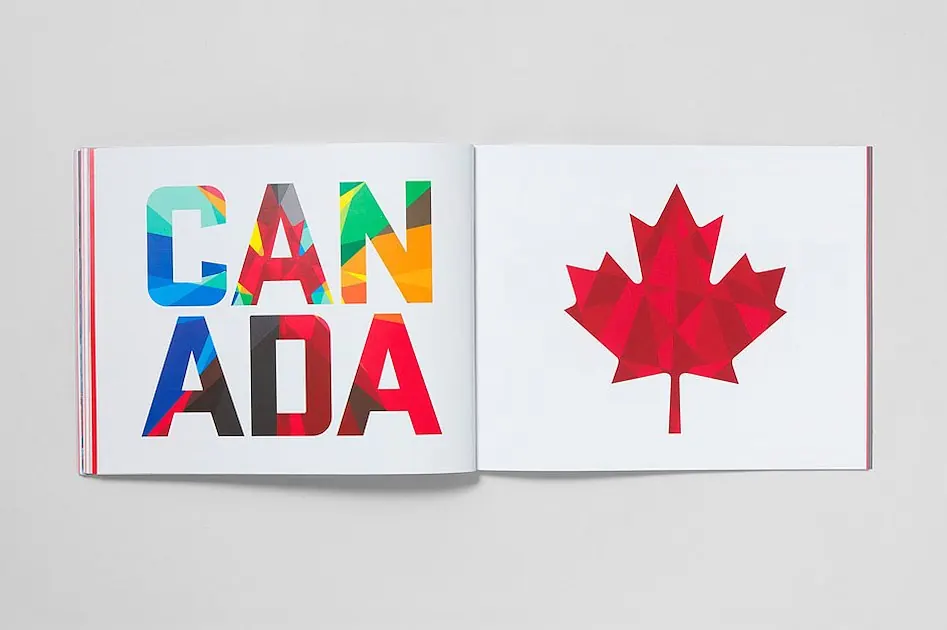
We spent time in libraries and talked with historians and Olympians before anyone drew a mark. The strategy that came out of that research moved the brand’s focus from the Committee back to the Team. The maple leaf anchors a system of lockups built for every sport and partner to use the same way. It includes marks for the Team, the Committee, the Canadian Olympic Youth Team and the Canadian Olympic Hall of Fame. Sponsors and suppliers get lockups of their own. The type pairs Eric Olson’s Stratum with Kris Sowersby’s National, and the colours come from the five Olympic rings and the Canadian landscape. An 86-page brand manual sets out how every part works together. We also wrote the copy and made the identity film.
“It was a daunting task to bring new life to a brand over a century old while respecting our rich heritage. We couldn’t be more proud.”
What changed
Two weeks after the COC unveiled the identity, Christian Palino reviewed it in Brand New and called the work “an exercise of both great restraint and great vision.” In 2011 the identity won two Brand New Awards in the Comprehensive Identity Programs and Guideline Documents categories. The awards went to entries titled “Canadian Olympic Committee by The Still Brandworks.” The Team carried the identity to the London 2012 Games.